Colour Matching and Tinting for Professional Painters
6 April 2026 · ProPainterTools
Colour Matching and Tinting for Professional Painters
Colour matching is part science, part managed expectation. Spectrophotometric technology has made same-brand matching highly accurate, but cross-brand matching, aged paint matching, and touch-up over weathered surfaces all carry real limits that clients do not always understand. A painter who can explain why a match cannot be guaranteed — before the work starts — avoids the disputes that follow an imperfect result. This guide covers the technical process of tinting and colour matching, the sources of error in each step, and how to manage client expectations around colour.
How Tinting Works
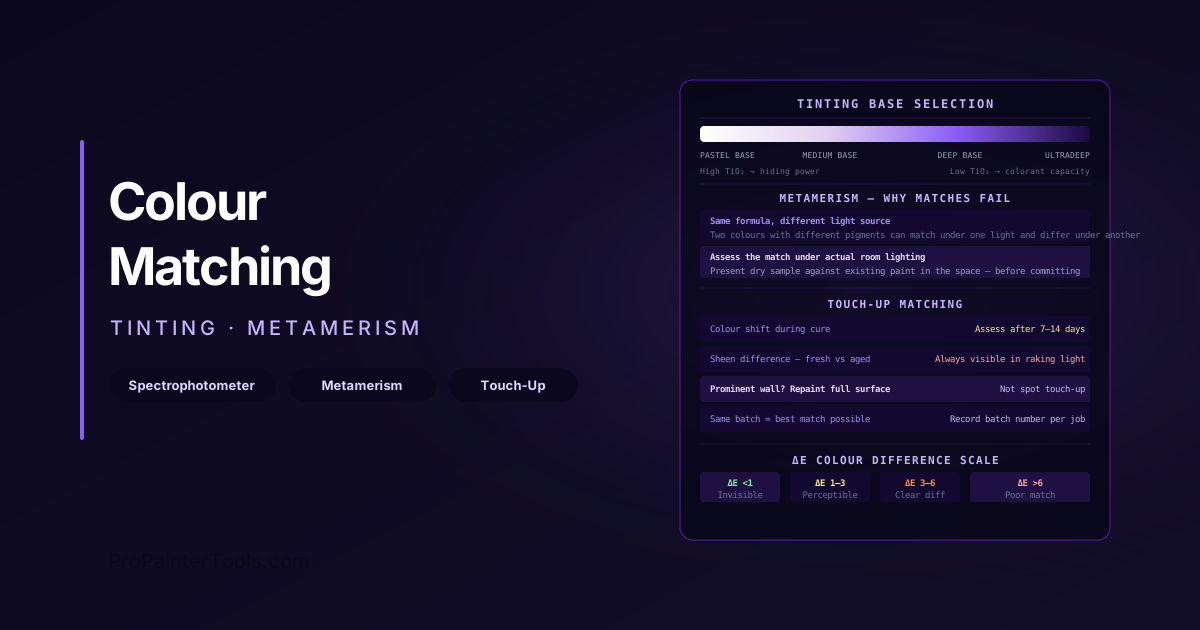
Most architectural paint is manufactured in a small number of bases — typically three or four — with pigment (colorant) added at the point of sale to produce specific colours. The bases are:
- Pastel or white base: High titanium dioxide content, providing full hiding. For light and pastel colours.
- Medium or accent base: Reduced TiO₂, for mid-tone colours. Higher colorant volume can be accommodated.
- Deep or ultradeep base: Very low TiO₂, almost clear. For saturated, dark colours where colorant volume is high.
- Clear base: No white pigment, used for stains, tinted varnishes, or specialised applications.
The paint formulation system (usually proprietary to each manufacturer) specifies the exact colorant type and volume to add to each base to reproduce a named colour. This is controlled by a tinting machine — a computerised colorant dispenser — using a formula either stored for the manufacturer's own colours or calculated from spectrophotometric matching.
Colorant Types
- Water-borne (universal) colorants: Used in most architectural paint systems. Compatible with both water-borne and oil-based paints.
- Oil-borne (alkyd) colorants: For oil-based products where universal colorants are not recommended.
- Organic pigments (phthalocyanines, quinacridones, carbazoles): Used for blues, greens, and saturated reds/violets. More UV-sensitive than inorganic pigments but provide more intense, clean colour.
- Inorganic pigments (iron oxides, earth colours): Used for browns, reds, ochres, and blacks. Highly UV-stable but limited chroma.
Spectrophotometric Matching
A spectrophotometer measures the reflectance of a surface at multiple wavelengths across the visible spectrum, producing a spectral curve. This curve is compared against stored colour formulas in the paint manufacturer's database, and the closest formula is selected.
What the spectrophotometer can and cannot do:
- Can do: Accurately match a colour chip, a paint sample, or a painted surface under the measurement conditions (geometry, light source) used in the device.
- Cannot guarantee: A match that looks the same under all lighting conditions (see metamerism below).
- Cannot do: Correct for weathered, chalked, or faded paint. The device reads the surface it is given — if the surface is faded, the match is to the faded colour, not the original.
Measuring existing painted surfaces: For touch-up and repaint matching, the spectrophotometer is placed flat against the existing painted surface. To get a good reading:
- Select a clean, unweathered area of the existing surface
- Avoid measuring over texture, edges, or shadows
- Take multiple readings and average if the device allows
- Be aware that old paint may have faded significantly — match to the current colour, not an assumed original
Metamerism: Why Matches Fail Under Different Light
Metamerism is the phenomenon where two samples appear to match under one light source but look different under another. It occurs because there are multiple ways to produce the same perceived colour using different combinations of pigments — those different pigment combinations have different spectral reflectance curves that cross each other.
Practical implications for contractors:
- A cross-brand colour match that looks perfect in the paint shop under fluorescent light may be visibly different in the client's home under incandescent or natural daylight.
- Touch-up paint from a fresh tin of the "correct" colour may show metamerism against aged paint on the wall — same formula, different perceived colour under certain light.
- Deep colours are more susceptible to metamerism than pastels, because deep colours use high volumes of organic colorants with steep spectral curves.
Managing the risk: When doing critical colour matching (touch-up in a prominent location, matching a discontinued colour), assess the match under the actual room lighting conditions before committing to application. Present the client with a dry sample against the existing paint in the space, under the actual lighting, before starting.
Base Selection and Its Effect on Colour
Choosing the wrong base is one of the most common colour matching errors in the trade.
- A deep colour specified in a pastel base will have insufficient colorant capacity — the formula will overflow the colorant limit of the tinting machine, or the colour will be pale and washed out.
- A light pastel tinted into a deep base produces a flat, murky colour with poor hiding — the high colorant-to-TiO₂ ratio means there is insufficient white to create brightness.
Rule: Always use the base specified in the manufacturer's colour formula. If cross-referencing between brands, verify that the base equivalents match in TiO₂ content level. When in doubt, have the paint shop confirm the correct base before mixing.
Deep Colour Considerations
Very deep and saturated colours (deep reds, navy blues, forest greens, blacks) require:
- Multiple coats — deep base paints with high colorant volume have lower hiding power per coat. Two to three coats may be required to achieve uniform coverage.
- Tinted primer — tinting the primer coat to a close approximation of the topcoat colour significantly reduces the number of topcoat coats required to achieve full hide.
- VOC check — deep-base paints can have higher VOC than pastel-base equivalents, and colorants add additional VOC. For compliance-sensitive projects, request the tinted paint VOC from the manufacturer (they should be able to provide this based on the formula).
Colorant VOC Contribution
Adding colorants at the point of sale changes the VOC content of the finished product. This matters for compliance-sensitive projects (LEED, occupied buildings, low-VOC specifications).
Key facts:
- Manufacturers publish colorant VOC contribution data (g/L per oz of colorant per gallon of paint)
- Deep-base paints receive significantly more colorant volume than pastel bases — the VOC contribution per unit of colorant is multiplied by a higher volume
- A pastel paint labelled "10 g/L VOC" tinted to a deep shade may reach 30–60 g/L depending on the colorant system used
- Request the as-tinted VOC from the manufacturer for any compliance-sensitive specification. See our VOC regulations guide for the limits that apply to your jurisdiction.
Touch-Up Matching: Setting Realistic Expectations
Touch-up matching is the most common colour dispute between painting contractors and clients. The fundamental issue is that paint changes after application:
- Colour shift during curing: Latex paints shift colour during the drying and curing process. A fresh patch applied to a wall that was painted a year ago will look different — the fresh patch is still undergoing colour shift, while the original paint has already stabilised.
- Weathering and fade: Exterior paint exposed to UV fades. Any fresh touch-up to faded paint will stand out unless the entire surface is repainted.
- Sheen difference: A touch-up area typically shows higher sheen (less flattening) than surrounding aged paint, due to fresh film on top of an older coat. This is visible in raking light.
Managing touch-up expectations:
- Inform the client that touch-up matching is never invisible over time — it may look acceptable immediately but become more visible as paint cures and ages.
- For prominent surfaces, recommend repainting the entire wall, not spot touch-up.
- Confirm in writing (or in your contract) that touch-up matching is performed to a reasonable standard, not guaranteed to be invisible.
- Keep the original batch number — same formula from a fresh tin of the same batch is the best possible match. Store client leftover paint details in your job records.
Tinting Limitations by Sheen
High-sheen finishes are more colour-accurate under controlled conditions but are also less forgiving of mismatch. A satin or gloss finish shows metamerism and touch-up differences more clearly than flat — the specular component of reflected light amplifies colour differences. This is the reverse of the intuitive assumption that glossy = better looking.
For touch-up in high-sheen areas (semi-gloss trim, satin walls), the probability of an acceptable touch-up diminishes faster than for flat ceilings or walls.
For a broader look at colour strategy for clients, including LRV, undertones, and how to price colour consultation, see our colour consultation guide. For exterior paint systems and how colour chemistry affects UV durability, see our exterior architectural coatings guide.
ProPainterTools allows you to record the paint product, base, formula code, and batch number for every colour used on a project — making future touch-up and repaint work faster and reducing the risk of formula errors.
Frequently Asked Questions
Why does my touch-up look different even though I used the same paint? The most likely causes, in order: (1) the original paint has aged and shifted colour; (2) the fresh touch-up paint is undergoing colour shift during cure and will look closer after 7–14 days; (3) the sheen of the fresh touch-up is higher than the aged surrounding paint; or (4) the batch number differs from the original. Let the touch-up cure fully before making a final judgement.
How accurate is cross-brand colour matching? At its best, cross-brand matching from a spectrophotometer is very close — within 1–2 ΔE (Delta-E, the standard colour difference unit) in most cases. A ΔE of less than 1 is imperceptible to most people under standard lighting. However, metamerism means the match may be good under one light and poor under another. For critical applications, test the match on a sample before committing to a full application.
Can a paint shop match a colour from a photograph on my phone? No reliably. Phone camera sensors do not capture spectral reflectance accurately, and photos are affected by lighting conditions, white balance, and image compression. Use a physical chip or a spectrophotometer reading on the actual surface.
What does ΔE (Delta-E) mean for colour matching? Delta-E is a numerical measure of colour difference in a standardised colour space (typically CIEDE2000). ΔE < 1 is imperceptible to most observers. ΔE 1–3 is just perceptible under close comparison. ΔE 3–6 is a clear colour difference. Most point-of-sale spectrophotometer systems aim for ΔE < 1.5 for same-brand matches; cross-brand matches may be ΔE 2–4 depending on the colours involved.
