Colour Consultation for Painting Contractors — Add a Paid Service That Wins More Jobs
23 April 2026 · ProPainterTools
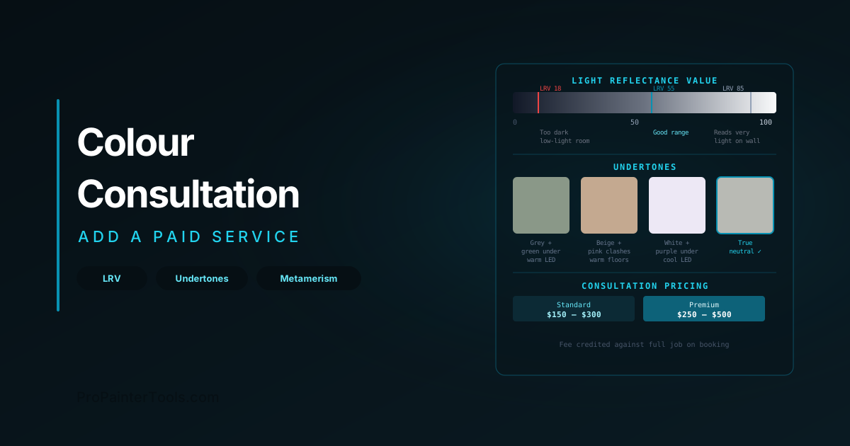
Colour Consultation for Painting Contractors: Add a Paid Service That Wins More Jobs
Most painting contractors give colour advice away for free — and most of the time, it creates more problems than it solves. The client picks a colour you recommended, it looks wrong on the wall, and now it is your problem. A paid colour consultation service reframes the dynamic: you are a professional delivering a professional service, the client is engaged and invested in the outcome, and colour selection is documented in the contract before a drop of paint is applied. This guide covers the technical knowledge that makes colour consultation credible and the business structure that makes it profitable.
Why Colour Consultation Is a Business Service, Not a Favour
The objection to charging for colour consultation is almost always: "But it only takes 20 minutes." That is wrong. Done properly, colour consultation includes:
- Pre-visit assessment of the space (photos, orientation, existing finishes, lighting)
- Physical sample review on-site in the actual light conditions
- LRV and undertone analysis to shortlist appropriate options
- Presentation of 2–3 options with sample boards or paint-out patches
- Follow-up when the client cannot decide between their final two options
This is a skill service that takes 2–4 hours across the engagement. It deserves to be paid.
The upsell case: Clients who have paid for a colour consultation are significantly more likely to proceed with the full paint job. They are invested. They have made a decision. They are not going to re-quote the job elsewhere after spending $200 with you on colour.
The Technical Foundation: What You Need to Know
Light Reflectance Value (LRV)
LRV is the percentage of light a colour reflects, measured on a scale from 0 (absolute black, absorbs everything) to 100 (perfect white, reflects everything). It is one of the most practically useful numbers in colour selection for contractors.
Why LRV matters:
- A colour at LRV 85 on a test chip will look significantly lighter on the wall than expected, because the surrounding wall area amplifies the perception of lightness
- A colour at LRV 30 will read dramatically darker on the wall than the chip — particularly in rooms with limited natural light
- Two colours that look similar on chips may have LRVs 10–15 points apart, and the difference will be very visible in a large painted area
Rule of thumb for LRV advice:
- Rooms with limited natural light: avoid colours below LRV 50 unless darkness is intentional
- Open-plan living areas with large windows: can comfortably use LRV 35–50 without the space feeling oppressive
- Any surface painted to contrast (door colour vs wall colour, accent wall): the LRV difference should be at least 20 points to read as intentional contrast
LRV values are published by every major paint manufacturer on their product data sheets and colour cards. Learn to read them.
Undertones
Every paint colour has an undertone — a secondary colour that becomes visible when the paint is applied in a large area, viewed under different lighting, or placed adjacent to other finishes in the room.
The three undertone traps that create client dissatisfaction:
- Green undertone in grey: Most mid-value greys pull green under warm incandescent or LED 2700K lighting. A client who chose a neutral grey on a chip walks in and sees a sage green wall.
- Pink undertone in beige/greige: Warm neutrals with a red/pink undertone clash with warm-toned hardwood floors — the undertone amplifies and the result reads as pink rather than neutral.
- Purple undertone in white: High-LRV whites on large ceiling areas can pull blue or purple under cool-spectrum LEDs, making the ceiling feel cold relative to warm-toned walls.
How to identify undertones: Hold the chip against a pure white card. The colour you see relative to white is the undertone. Alternatively, apply the colour to a large test area and observe it under the specific lighting the room will use — daylight at different times of day and under the installed light fixtures.
Metamerism
Metamerism is the phenomenon where two colours that appear identical under one light source appear different under another. This is not a quality defect — it is a physical property of how pigments absorb and reflect different wavelength compositions.
Why this matters for contractors: A client approves a colour on a paint chip under the fluorescent lighting of a paint shop, then is unhappy when it looks different in their home under warm LED fixtures. Without an explanation of metamerism, this becomes a dispute about the colour being "wrong."
Managing metamerism professionally:
- Review all colour selections under the actual lighting the space will use — not the paint store lighting
- When recommending colours for rooms with mixed lighting (south-facing with both daylight and warm LEDs), assess under both conditions
- Document the light source under which the colour was approved in your scope notes
Running the Consultation
The Pre-Visit Process
Before visiting the site, ask the client for:
- Photos of the space, including close-ups of fixed finishes they are keeping (floor, countertop, tile)
- Direction the main windows face (south-facing rooms have very different light conditions than north-facing)
- What they are trying to achieve (lighter, warmer, cohesive, bold, neutral)
This pre-work saves time on-site and demonstrates professionalism before you arrive.
On-Site Assessment
- Pull large paint chips (4" × 6" minimum — small chips are misleading) in your pre-shortlisted colours
- Hold chips directly against the fixed finishes they must work with
- Assess in the actual light condition — open the blinds; turn on every light that will be used
- Identify undertone interactions with existing finishes
- Narrow to 2–3 final candidates
Sample Application
For premium consultations and any colour with a significant undertone risk, apply sample patches — minimum 12" × 12", preferably larger — directly on the wall. Allow to dry fully before assessing (wet paint is always darker than the dry result).
Leave sample patches for the client to observe at different times of day and under different lighting before making a final selection.
Presenting the Recommendation
Deliver a one-page colour spec sheet that includes:
- Manufacturer, colour name, and code for each recommended colour
- The surface each colour is intended for
- LRV of each colour
- Notes on undertone considerations discussed
- The light source under which the selection was approved
This document becomes part of the contract package.
Pricing the Service
Market rates for standalone colour consultation (US, residential):
- Basic (1–2 rooms, chip review, no sample application): $100–$175
- Standard (whole-home shortlisting, 1–2 sample patch applications): $150–$300
- Premium (full whole-home assessment, multiple sample applications, written spec sheet): $250–$500
When the client proceeds with the full painting job: Most contractors apply the consultation fee as a credit against the project — it removes the objection to paying for it while still establishing the professional framing. The credit is only applied if the full job is booked; it does not carry over as cash.
When offering consultation as part of winning a competitive bid: Do not discount or bundle the consultation into a proposal for free — this teaches clients that it has no value. Instead, price the job and note: "Colour selection consultation is available as a separate service at $X, credited against the project on booking."
Documenting Colour Selections in the Contract
The most important outcome of any colour consultation — paid or otherwise — is that the selected colour is documented before work begins. This eliminates the most common mid-project dispute in residential painting.
Contract language for colour documentation:
"Painting scope as specified below will be completed using the following products and colours, as agreed and approved by the Client prior to commencement of work. Any change to the specified colour or product after work has commenced will be treated as a change order and priced accordingly."
Then list, in a table:
- Surface/zone
- Manufacturer and product name
- Colour name and code
- Sheen level
- Number of coats
Post-paint-out documentation: For larger projects, have the client initial the spec table after final colour approval and before painter crews mobilise. This creates a paper trail and prevents the situation where a client claims they "never agreed" to a colour they selected three weeks earlier.
For the complete contract template including change order language and scope of work structure, see our contract templates guide. For how material and colour decisions feed into your estimate structure, see our estimating guide.
Frequently Asked Questions
Do I need to be a certified colour consultant to offer this service? No certification is required. However, completing the Colour Marketing Group training, the Paint Quality Institute's contractor education, or equivalent courses will deepen your technical knowledge and add credibility when marketing the service. The knowledge in this guide is the working foundation; formal training adds breadth.
What if the client chooses a colour I think will look wrong? Document your recommendation and their override. "Client has selected Colour X. Contractor recommended Colour Y for the following reason: undertone/LRV concern. Client has confirmed their selection in writing." This is not about refusing to execute their choice — it is about protecting yourself when they later say it looks wrong.
Should I recommend specific paint brands? In a consultation, you can recommend based on your professional experience with the products you use. The consultation is about colour and process, not a sales tool for specific products. For projects where you are supplying the paint, you are free to specify your preferred brand — just confirm the colour match if switching brands from what was discussed during the consultation.
How do I market colour consultation as a service? Add it to your website, estimate template, and first-contact communications as a line item with a price. The fact that it has a price communicates that it has value. Clients who have never worked with a contractor who charges for colour advice will not ask for it if you do not offer it — so offer it proactively as part of every residential proposal.
